Frontend viewport testing
Preview Mobile, Tablet, and Desktop Viewports Side-by-Side
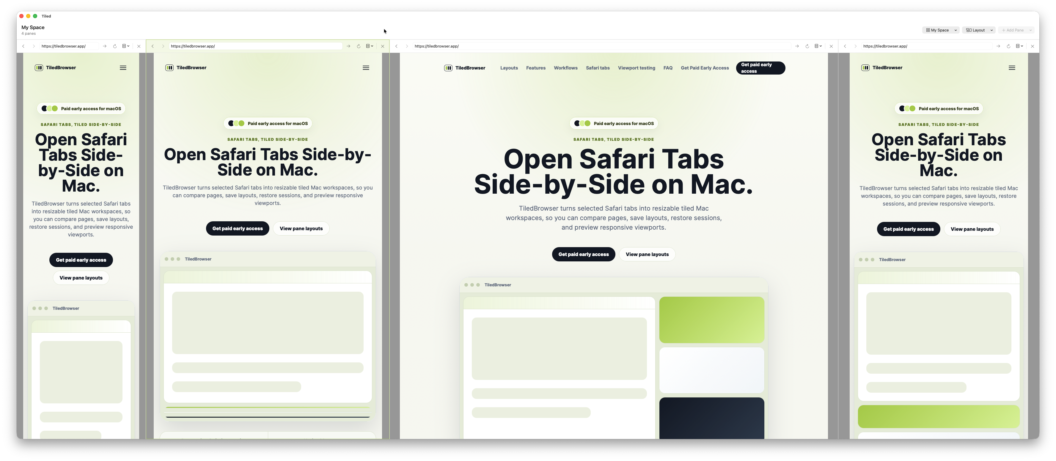
TiledBrowser helps frontend developers compare multiple viewport widths in one Mac window. Open mobile, tablet, and desktop panes side-by-side, keep documentation nearby, and reduce constant browser resizing.
Compare responsive breakpoints
Use separate panes for mobile, tablet, and desktop views so layout changes stay visible while you work. It is useful for checking navigation, wrapping, spacing, and content density across common widths.
Keep docs and implementation side-by-side
Put the local build, documentation, design reference, issue tracker, or production page in adjacent panes without constantly switching tabs or resizing windows.
Review in a WebKit context
TiledBrowser uses native WKWebView panes, which makes it useful for Safari-oriented frontend checks on macOS.
Use pane presets and custom sizes
Pane widths can be adjusted for flexible layouts, common viewport presets, or custom checks when a specific breakpoint needs attention.
BuyDigital license purchase. Generally non-refundable once the license key is issued.